Execon
think.make.go!
Szczegóły Projektu
Execon are successful IT consultants. Their principle is that the value of delivered solutions is a direct result of the skillful selection and use of technology. It is because of that principle that they put so much emphasis on understanding customer needs and on reflecting them within implemented solutions.
When it comes to creating brand identity we believe in similar standards. Reflecting the brand’s true DNA within its logo requires a careful selection of appropriate stylistic designs and the design stage must be preceded by meeting with the client. Execon has asked us to refresh their look. After a couple of meeting we realized that we need to take it a step further.
Client: Execon
Year: 2015
Scope of work: Identification, Branding, UX/UI, Design, Webdesign


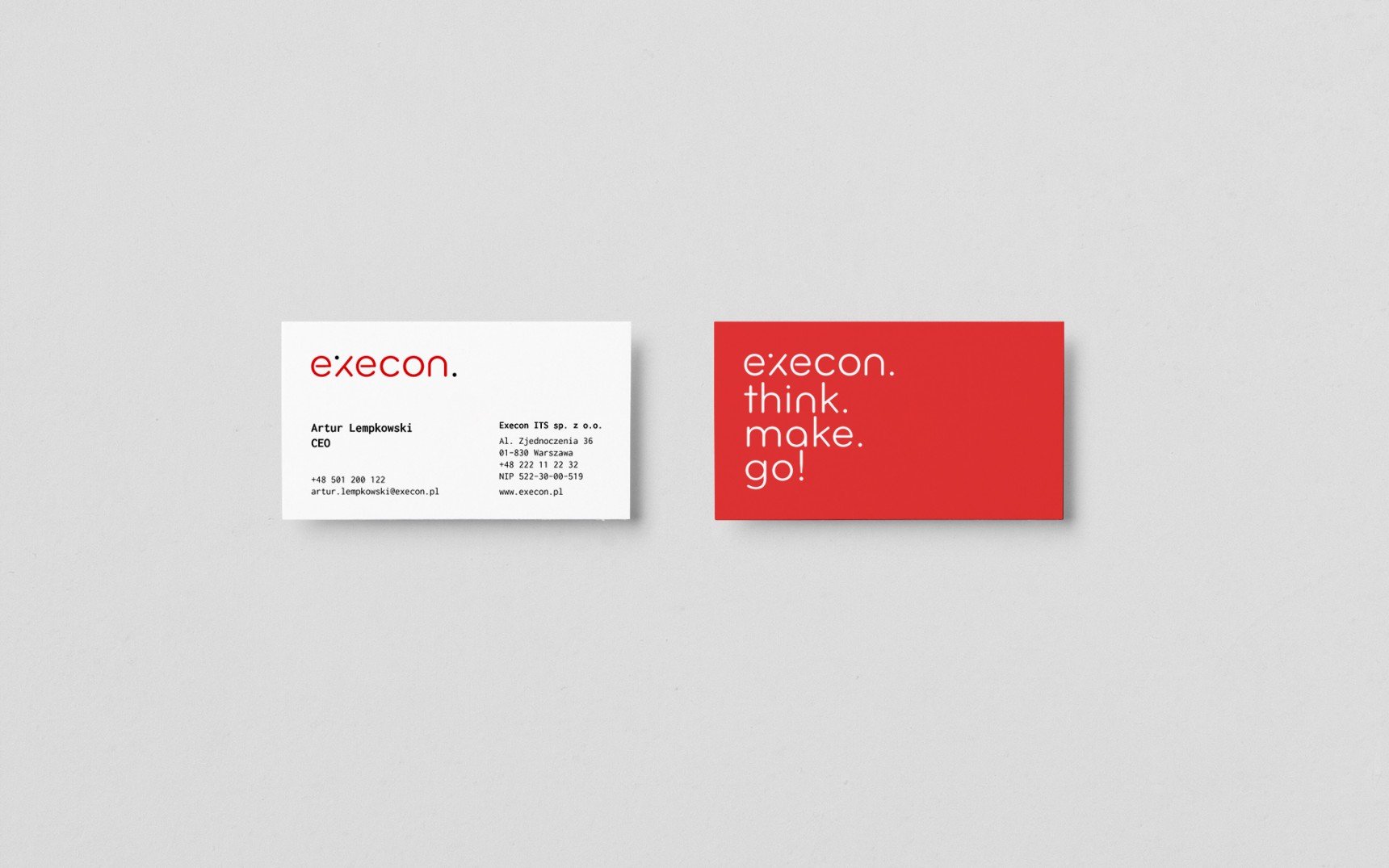
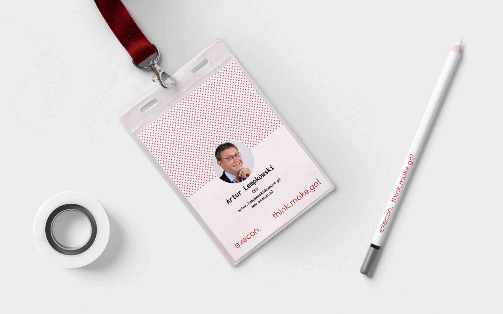
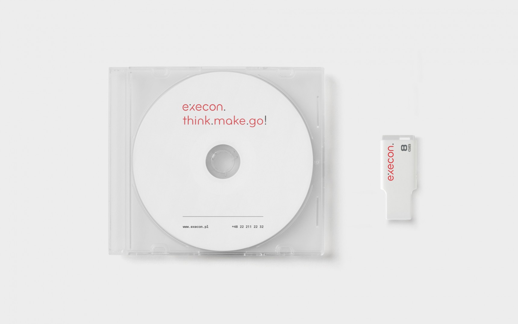
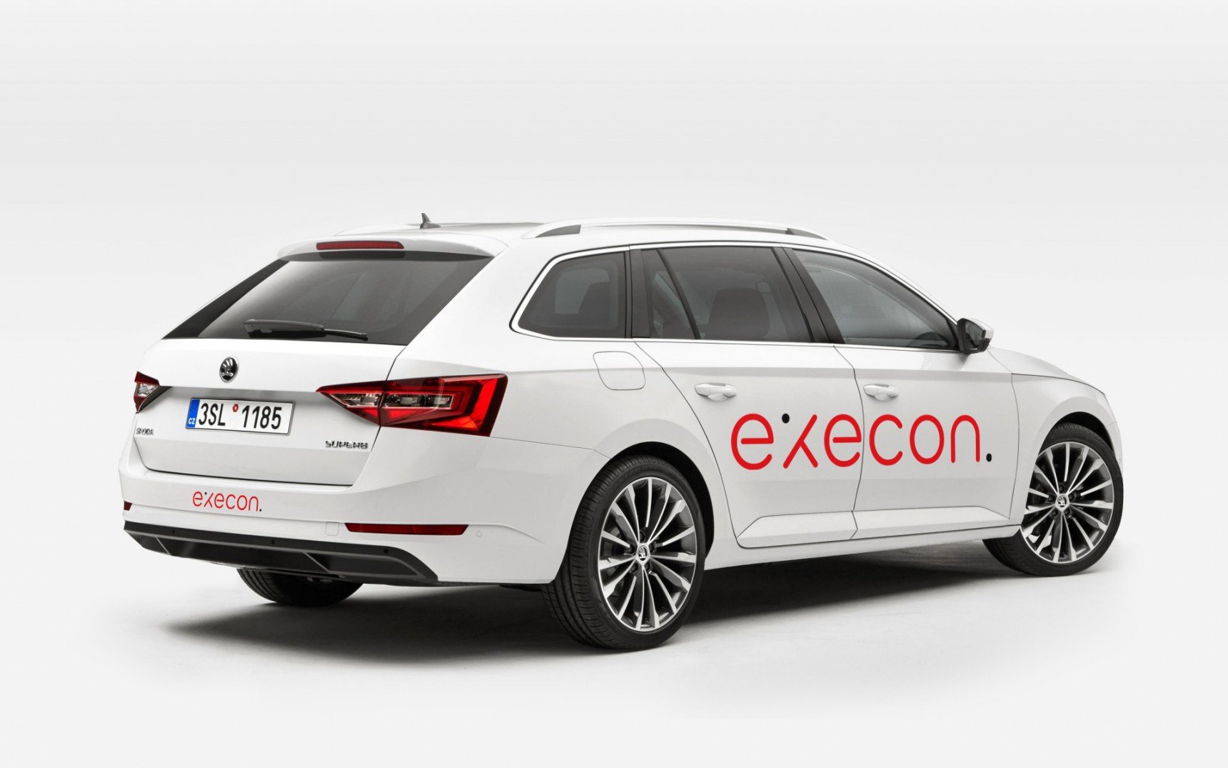
New logo
The new logo is discreet, simple and bold. The distinctive shape of the “x” glyph emphasizes its modernity and dynamism and, with the finishing dot, creates its unique character. The whole is complemented by Inconsolata – a monospaced font that can be seen primarily in programming. And finally – the new character fits perfectly into Execon’s motto. Think.Make.Go!